Disclosure: Some links in this post are affiliate links. BranchNova may earn a commission at no extra cost to you.
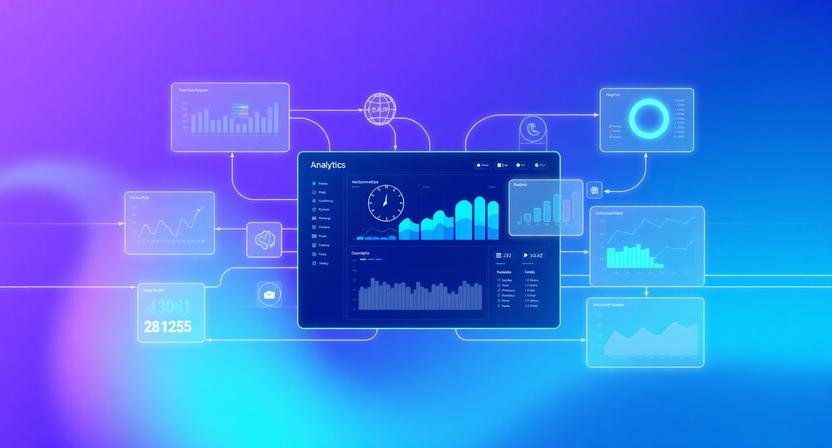
AI automated analytics dashboard tutorial systems are not where most teams fail at analytics. They fail because the data is scattered, delayed, or manually assembled across tools that don’t talk to each other.
In practice, a 5-person startup can survive with manual dashboards in Google Sheets. A 20–50 person team cannot. Reporting becomes a bottleneck, not an insight engine.
This is where AI-assisted analytics automation changes the operating model—not by replacing tools, but by stitching them into a self-updating decision system.
BranchNova AI Toolkit
Explore the Top 10 AI productivity tools used to build scalable analytics systems, automate reporting workflows, and connect cross-team dashboards without manual overhead.
Where Most Dashboard Systems Break (Before AI Even Helps)
In early-stage teams, dashboards usually fail in predictable ways:
- Marketing pulls data from one tool (e.g., ads platform)
- Sales operates in a separate CRM
- Product uses event analytics (often underutilized)
- Finance reconciles everything late, usually weekly or monthly
The result isn’t “lack of data”—it’s time-lagged truth.
A typical 10-person SaaS team spends:
- 3–6 hours/week manually updating reports
- Another 2–4 hours reconciling inconsistencies
- And still makes decisions on partial data
AI doesn’t fix bad tracking. It fixes aggregation, normalization, and interpretation speed.
But only if the system is designed correctly.
The Real Goal: A Living Dashboard, Not a Reporting Tool
Most teams think they’re building dashboards.
High-performing teams are actually building:
A continuously updated decision layer across departments.
That distinction matters.
A static dashboard answers: “What happened?”
An AI-driven dashboard answers: “What should we do next, based on what changed?”
For example:
- If CAC increases 18% in paid channels
- And activation rate drops in onboarding
- The system flags correlation, not just metrics
That shift is where automation becomes strategic.
Step-by-Step: Building an AI-Automated Analytics System
This workflow assumes a 10–50 person team using common SaaS tools (CRM, product analytics, marketing platforms, spreadsheets).
Step 1: Define a Unified Metric Layer (Before Any Automation)
Most failures happen here.
You need to standardize 5–10 core metrics across the company:
Example for a SaaS team:
- CAC (Customer Acquisition Cost)
- Activation rate
- Weekly active users (WAU)
- Pipeline velocity
- Churn rate
- Revenue per cohort
Critical constraint most tutorials ignore:
If every team defines metrics differently, AI will only automate confusion faster.
This step is non-negotiable.
Step 2: Centralize Data Inputs (Not Tools)
You are not trying to “replace tools.” You are creating a single ingestion layer.
Typical setup:
- CRM (sales data)
- Product analytics (usage data)
- Ads platforms (acquisition data)
- Billing system (revenue data)
These feed into:
- A warehouse (or lightweight equivalent)
- Or a no-code aggregator
What breaks in real teams:
- Teams try to connect everything directly to dashboards
- APIs fail or drift
- Data schemas evolve without governance
Instead, enforce one rule:
All systems must feed into a single normalized structure before visualization.
For teams operationalizing this system end-to-end, tools like ClickUp can act as the workflow orchestration layer, helping centralize tasks, reporting pipelines, and cross-team execution into a single structured environment.
Step 3: Add AI Layer for Data Interpretation (Not Storage)
This is where most people over-engineer or misuse AI.
AI should NOT:
- Replace dashboards
- Store raw data
- Make final business decisions
AI SHOULD:
- Summarize anomalies
- Detect trends across datasets
- Flag inconsistencies
- Generate narrative insights
Example output:
“Paid acquisition efficiency dropped 14% this week, primarily driven by mobile campaigns. However, retention improved slightly, suggesting higher quality but higher-cost users.”
This is the shift from reporting → interpretation.
Step 4: Build Automated Insight Triggers (The Real Scalability Engine)
Instead of checking dashboards daily, set conditions:
Examples:
- If CAC increases >10% week-over-week → alert
- If churn spikes in any cohort → flag
- If conversion rate drops in onboarding → trigger review
In practice, this is where AI becomes operationally useful.
For a 20-person team, this removes:
- 60–70% of manual monitoring
- “Weekly metric panic meetings”
- Delayed reaction cycles
But here’s the tradeoff most people miss:
Over-triggering alerts leads to alert fatigue and system distrust.
You need strict thresholds—not everything should become a notification.
Step 5: Add Narrative Layer for Leadership Decisions
Dashboards fail when they show data without context.
AI can generate weekly summaries like:
- What changed
- Why it likely changed
- What teams should investigate
- What is noise vs signal
This is especially powerful for distributed teams.
Example:
A marketing lead in Berlin and a product team in Toronto see the same synthesized explanation instead of 5 disconnected charts.
When This System Does NOT Work Well
This is important and often skipped:
AI-driven dashboards struggle when:
- Data sources are poorly structured or inconsistent
- Teams lack agreed definitions for key metrics
- Business model is still changing weekly (very early startups)
- There is no ownership of data quality
In those cases, automation amplifies chaos instead of clarity.
Common Mistake: Automating Too Early
Many teams try to build AI dashboards before they have:
- Stable funnels
- Consistent tracking events
- Defined revenue attribution logic
That leads to:
- Beautiful dashboards with wrong conclusions
- Conflicting AI-generated insights
- Loss of trust in analytics entirely
A better sequence is:
- Stabilize metrics
- Standardize data flows
- Introduce automation
- Add AI interpretation layer
Not the reverse.
BranchNova Summary
Automating analytics dashboards with AI is not about replacing reporting tools—it’s about building a unified decision system across teams.
In most scaling companies, the bottleneck is not data availability, but data alignment and interpretation speed.
When properly implemented, AI shifts analytics from static reporting to real-time operational awareness. But it only works when metric definitions, data pipelines, and alert logic are standardized first.
Otherwise, automation simply accelerates confusion.
Actionable Implementation Steps
- Define 5–10 core company-wide metrics with strict definitions
- Consolidate all data sources into a single structured layer
- Add AI summarization for trends and anomalies (not storage)
- Build threshold-based alerts for key business changes
- Generate weekly AI-written insight summaries for leadership
Key Takeaway
If your team still debates what the numbers mean, AI dashboards won’t help yet.
Fix interpretation first—then automate reporting.
Discover More Insights
About the Founder
Learn more about our founder, Esa Wroth, and his mission to make AI practical, human-centered, and accessible for entrepreneurs, creators, and professionals.